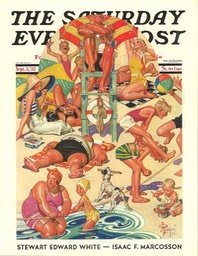
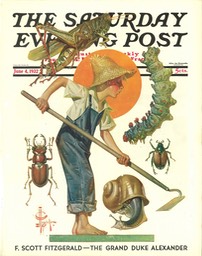
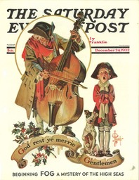
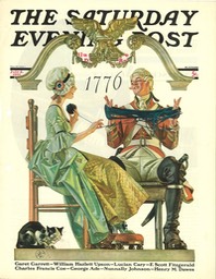
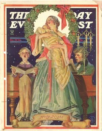
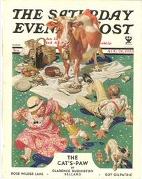
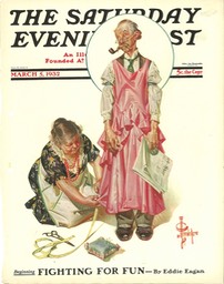
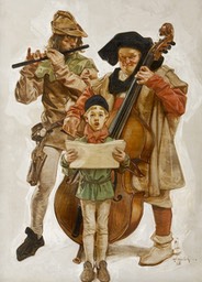
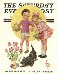
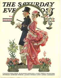
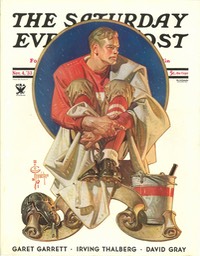
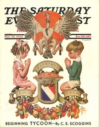
J.C. Leyendecker, by Charley Parker
If
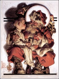
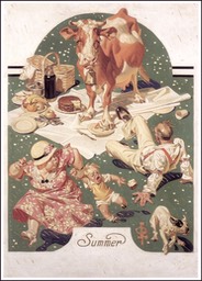
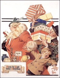
you were to ask most people to name the most successful American
illustrator of the first half of the 20th Century, who was a classically
trained artist and master craftsman, who was in large part responsible
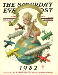
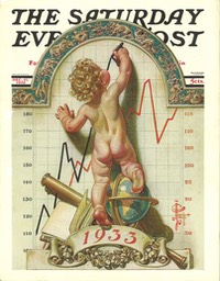
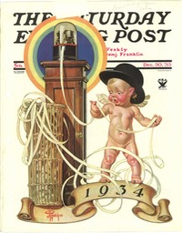
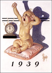
for the popular image we have of Santa Claus, who created the notion of
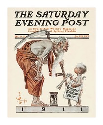
using a baby to represent the New Year in illustrations, whose
productive career spanned 50 years, who basically invented the look of
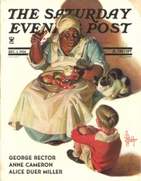
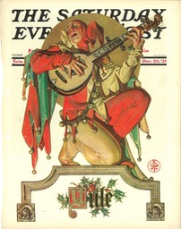
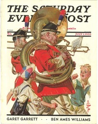
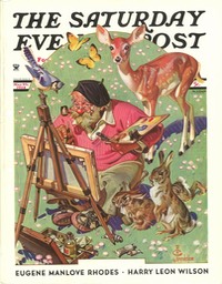
20th Century magazine cover design, and who painted more Saturday
Evening Post covers than any other artist — the answer would invariably
be “Norman Rockwell,” an answer that would just as invariably be wrong.
In
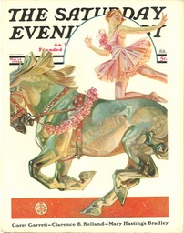
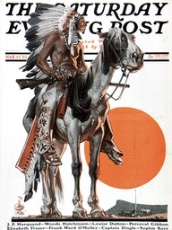
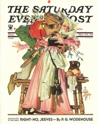
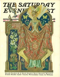
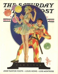
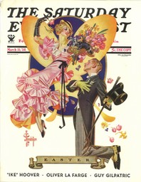
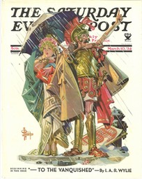
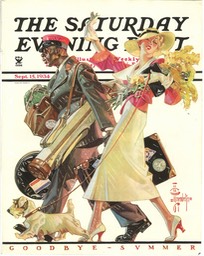
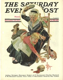
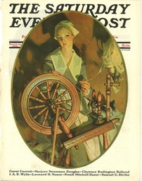
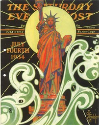
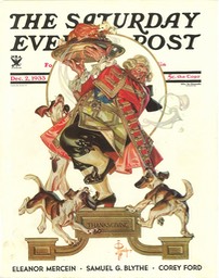
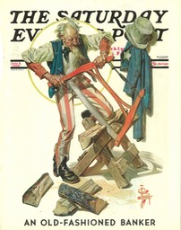
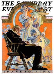
fact, this is a description of Joseph Christian Leyendecker, whose
position of relative modern obscurity compared to Rockwell just boggles
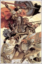
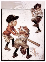
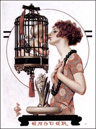
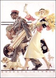
my mind. Leyendecker was a fantastic illustrator whose paintings are
marvels of design, draughtsmanship and the beautifully controlled
application of color.
At a
time when illustrators of his stature were treated like current day
rock stars, Leyendecker led a very private life, perhaps to keep his
relationship with Charles Beach, his model, manager, assistant and
companion, out of the public eye. His creations became stars in their
own right, though.
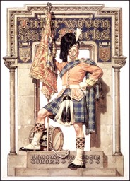
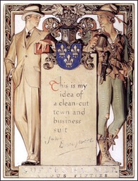
Leyendecker’s
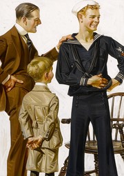
most famous illustrations were the series he created for Arrow Shirts
featuring the “Arrow Collar Man,” an elegantly dapper guy who received
thousands of fan letters and marriage proposals from swooning women, and
who set standards for what was considered a masculine ideal at the time
(sort of a male version of the Gibson Girl). The campaign was notable
as being one of the first to deliberately sell a “lifestyle” instead of
just a product.
Leyendecker
also set new standards for illustration art. He and his brother Frank
X. Leyendecker, also a terrific and under-appreciated illustrator,
studied in Paris at the famed Académie Julian when William Bouguereau,
the Academician’s Academician and a superb painter, was its director.
They attracted much attention even then as talented art students among
the best in Europe, in sharp contrast to their current lack of
attention. Frank receives even less attention than Joseph, apparently in
his brother’s shadow in posterity as well as in life.
Norman
Rockwell was a great admirer of Leyendecker, who he considered the
ideal for which he aimed when he began doing Post covers. He eventually
became friends with the Leyendecker brothers and a chapter in his
autobiography is one of the few personal accounts that exist from those
who knew them.
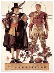
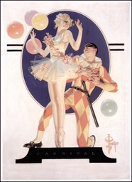
Leyendecker
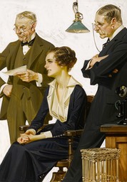
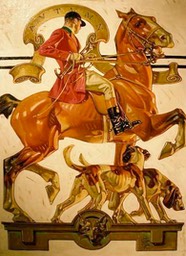
had a tremendous impact on other illustrators. His work is dazzling in
its technical proficiency, beautifully composed and designed, and drawn
with the kind of flair and refined skill that only comes to the best of
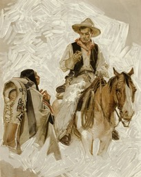
the best. He would make the application of paint (supposedly with a
secret proprietary oil painting medium) appear as part of the design,
with strokes of color defining the form in his paintings the way
hatching is used in drawings, and often allowing parts of the
underpainting show through.
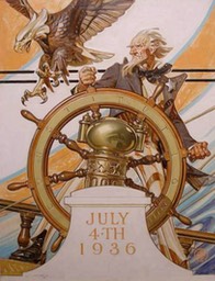
He
was also a genius for finding “the straight within the curved”, and his
figures have a sharp, crisp geometry that makes them really snap.
Seemingly simple things like folds in cloth became wonders of painted
design, zig-zagging valleys of carefully controlled color, highlighted
with those amazing strokes of color hatching.
Leyendecker
reportedly worked in stages, creating many small-scale studies from
which he would then construct the whole using the traditional technique
of “squaring up” to transfer to the larger canvas. The American Art Archives site has a great page of his studies that is not to be missed by anyone
interested in the techniques of one of the great illustrators.
Originally posted by Charley Parker on his blog, Lines and Colors, on November 25, 2006.
Leyendecker’s Method
In December of 1950, Saturday Evening Post cover artist J.C. Leyendecker outlined his basic method in a letter to a student.
“My first step is to fill a sketch pad with a number of small rough sketches about two by three inches, keeping them on one sheet so you can compare them at a glance.
“Select the one that seems to tell the story most clearly and has an interesting design. Enlarge this by square to the size of the magazine cover, adding more detail and color as needed.
“You are now ready for the model. First make a number of pencil or charcoal studies. Select the most promising and on a sketch canvas do these in full color, oil or water with plenty of detail. Keep an open mind and be alert to capture any movement or pose that may improve your original idea.
“You may now dismiss your model, but be sure you have all the material needed with separate studies of parts to choose from, for you are now on your own and must work entirely from your studies.
“This canvas will somewhat resemble a picture puzzle, and it is up to you to assemble it and fit it into your design at the same time simplify wherever possible by eliminating all unessentials. All this is done on tracing paper and retraced on the final canvas.
“Your finished painting may be any size to suit you, but is usually about twice the size of the reproduction.
“As a rule, I start work with a round or flat sable using a thin wash, with turps as a medium. Keep shadows very transparent, and as the work progresses, apply the paint more thickly on lighted areas, adding some poppy oil or linseed oil if necessary, and using a larger flat bristle brush for the heavier paint, but still keeping the shadows thin and vibrant.
“When the work is dry, apply a quick drying retouching varnish either with a brush or an atomizer.
“Sometimes because of prohibitive model rates or other reasons, one is forced to use photography, but try and avoid it if possible.”
Originally posted by James Gurney on his blog, Gurney Journey, September 10, 2010.
